

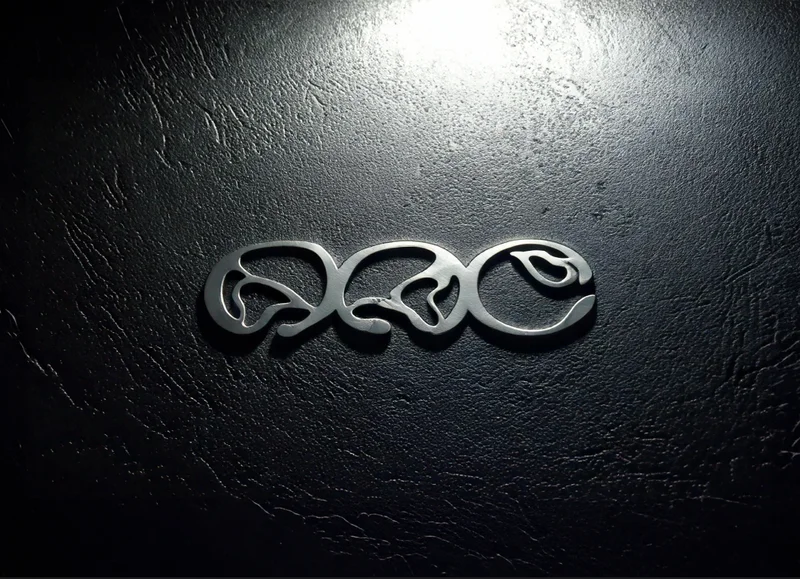
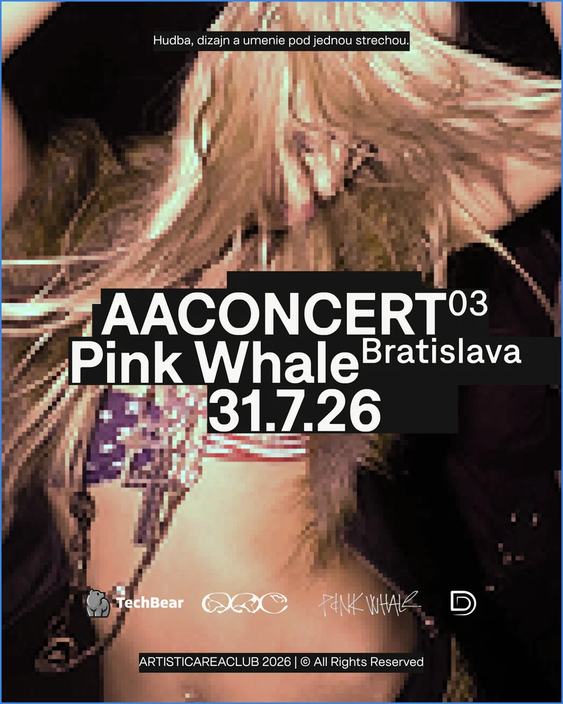
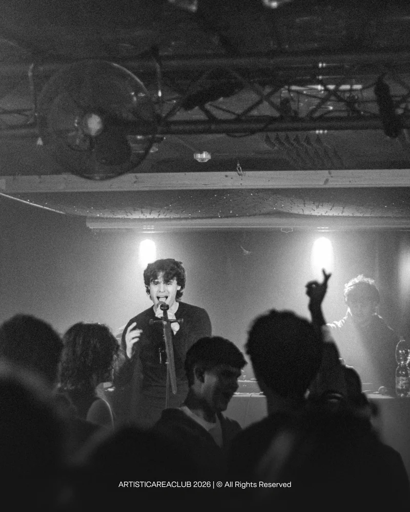
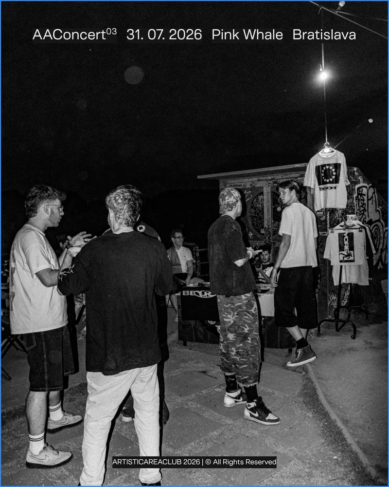
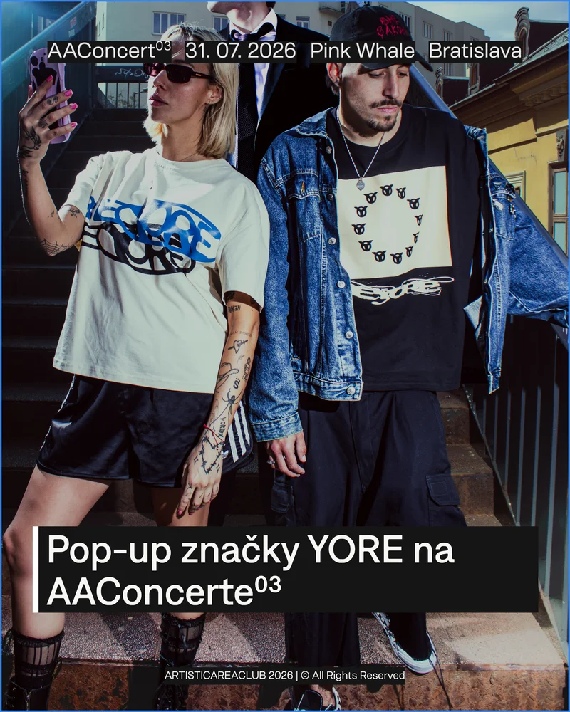
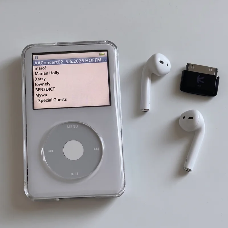
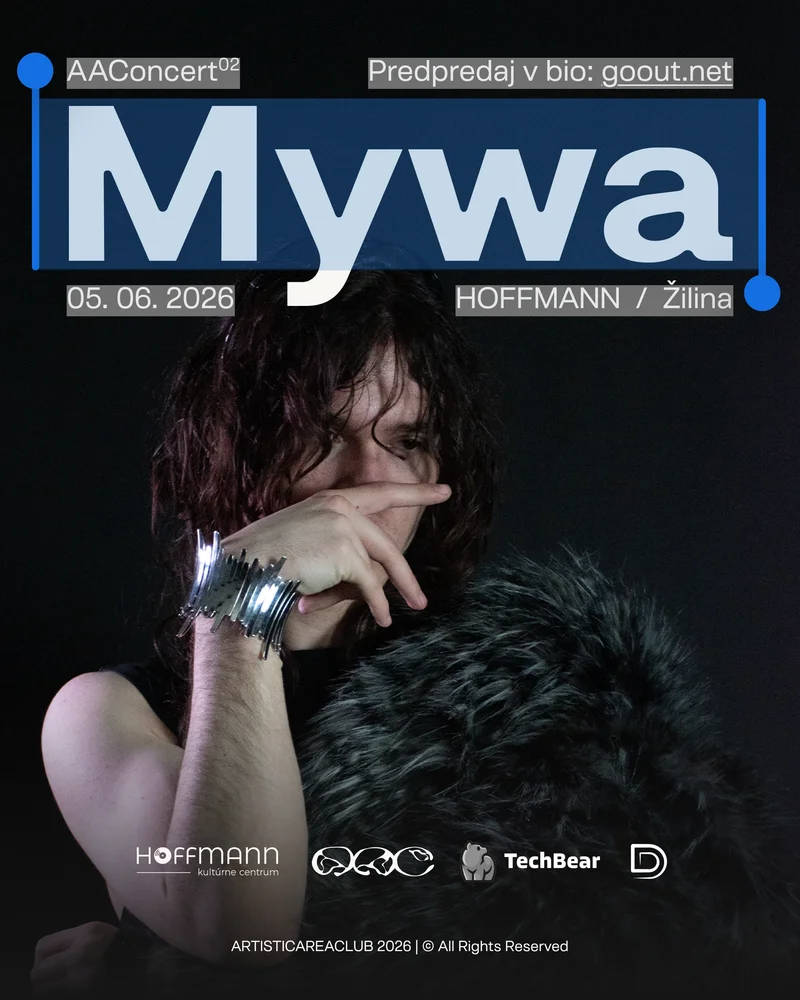
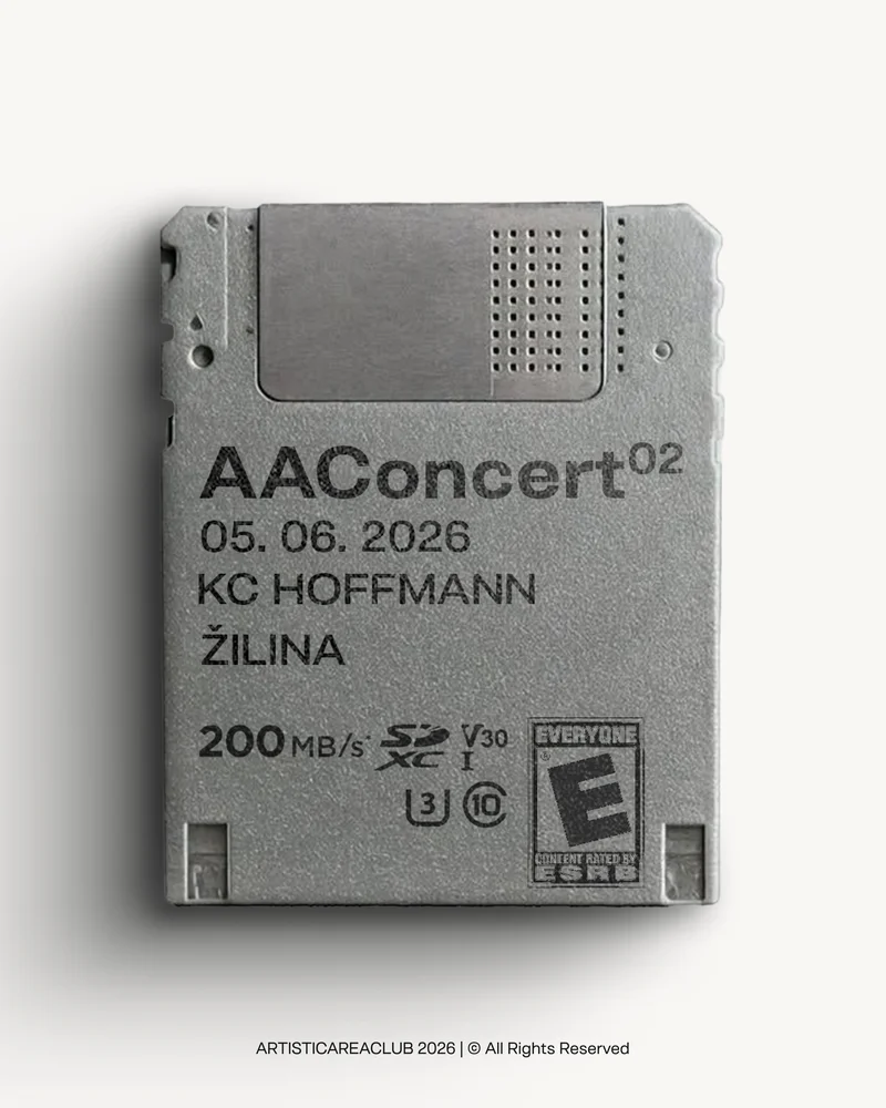
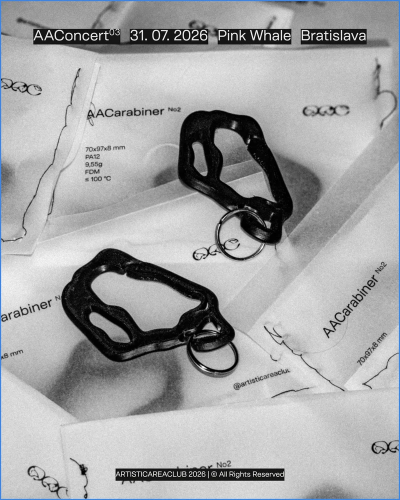
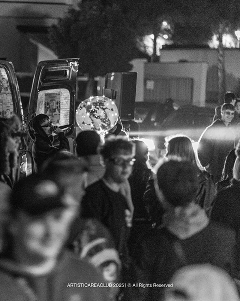
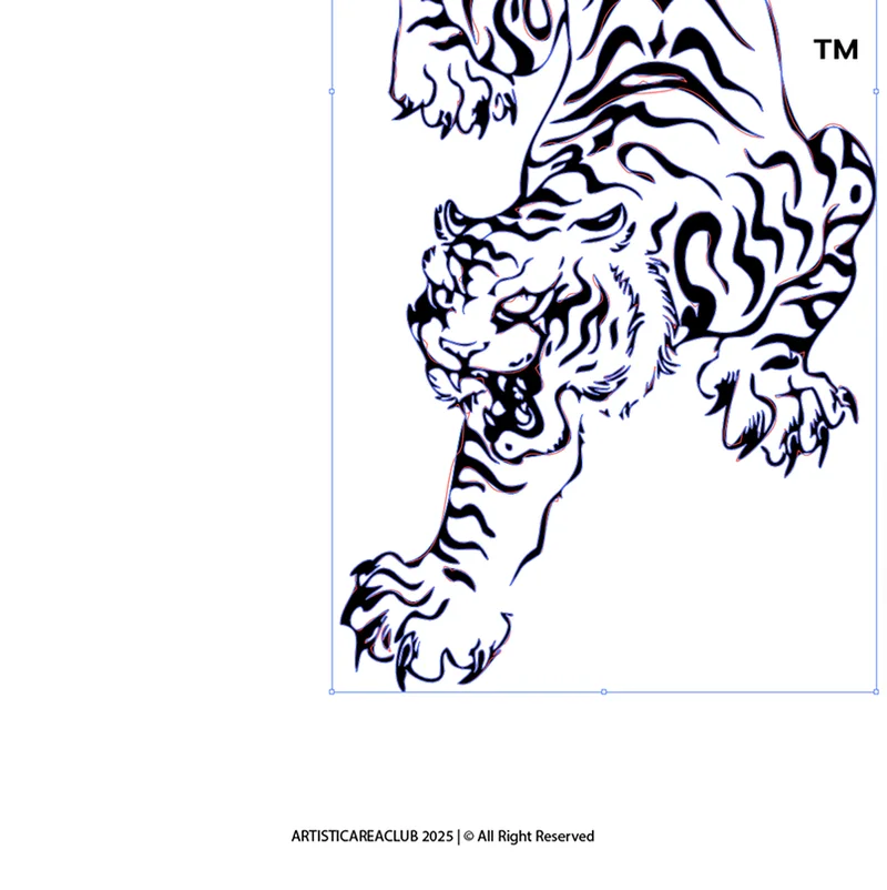
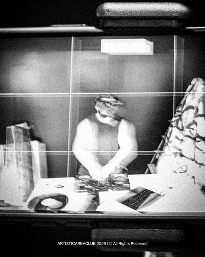
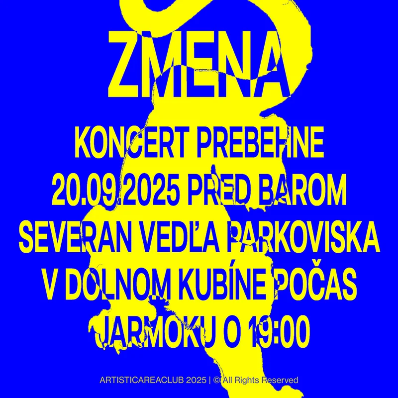
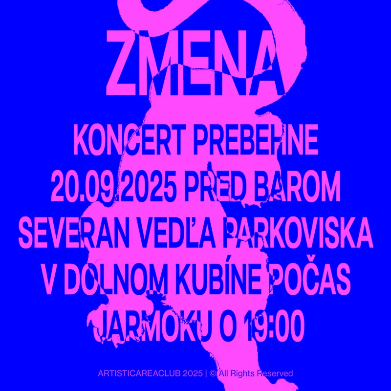
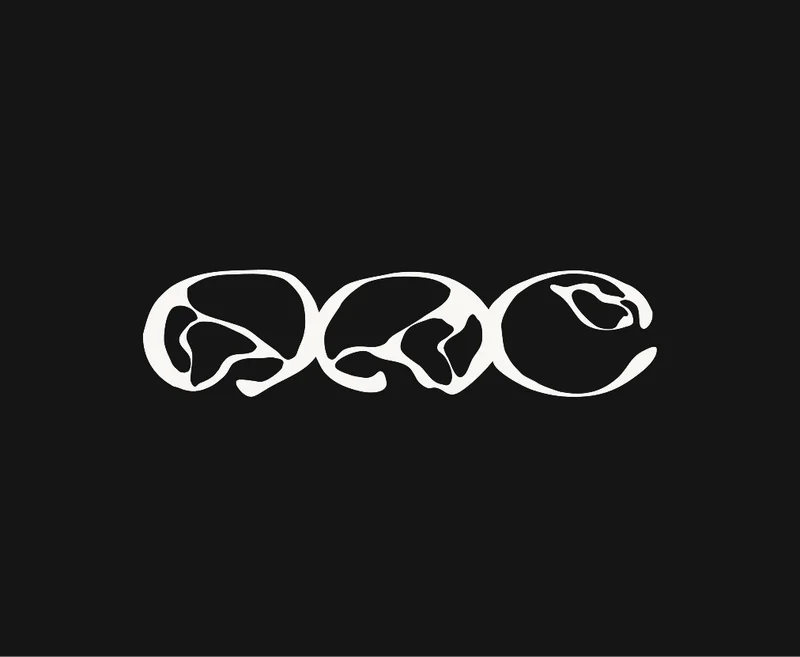
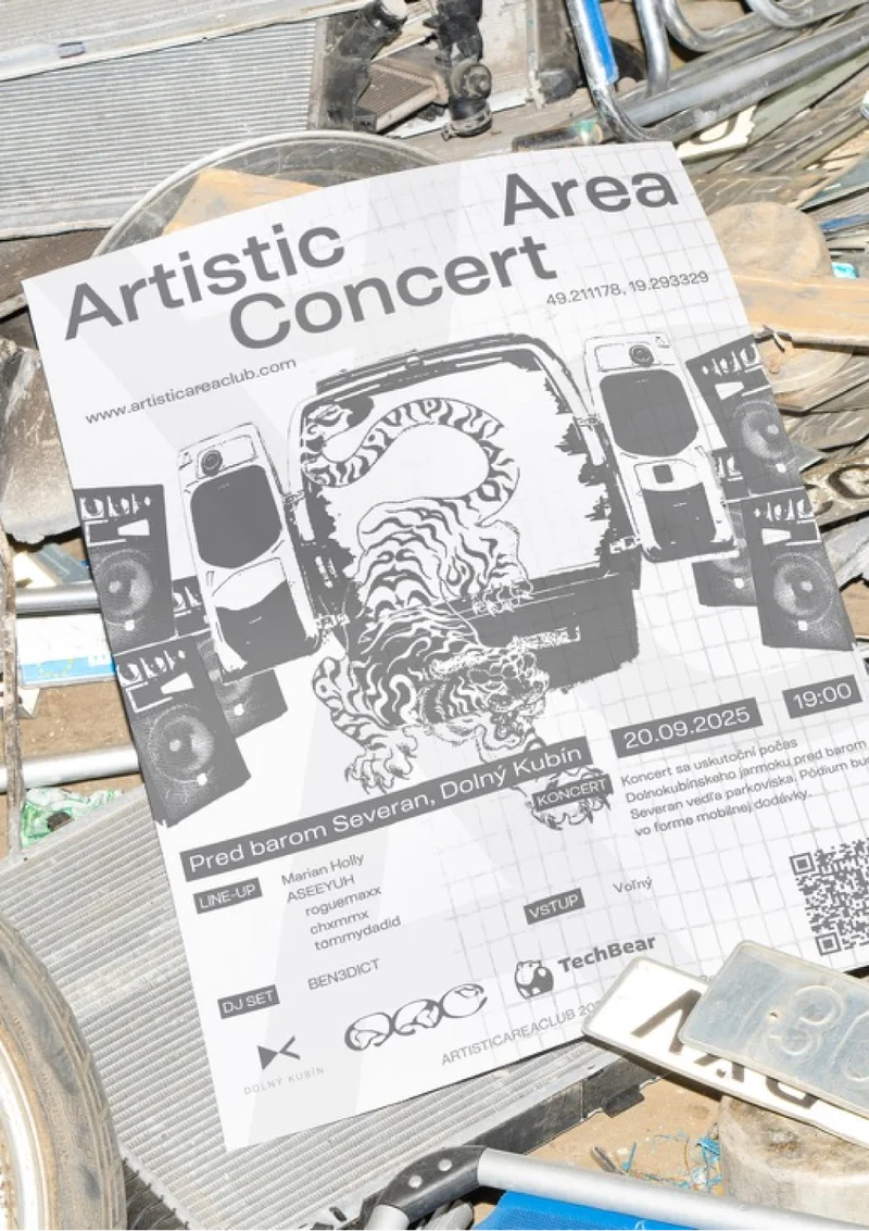
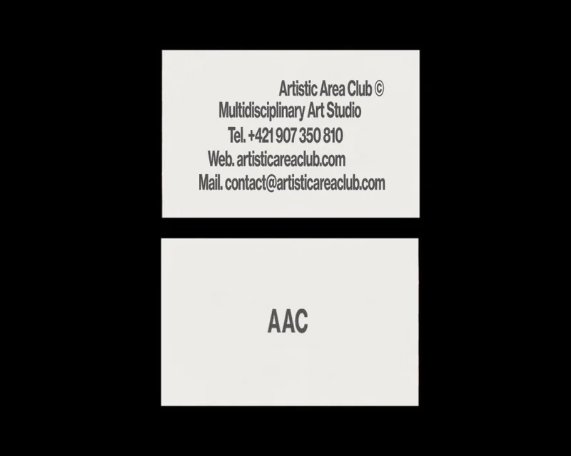
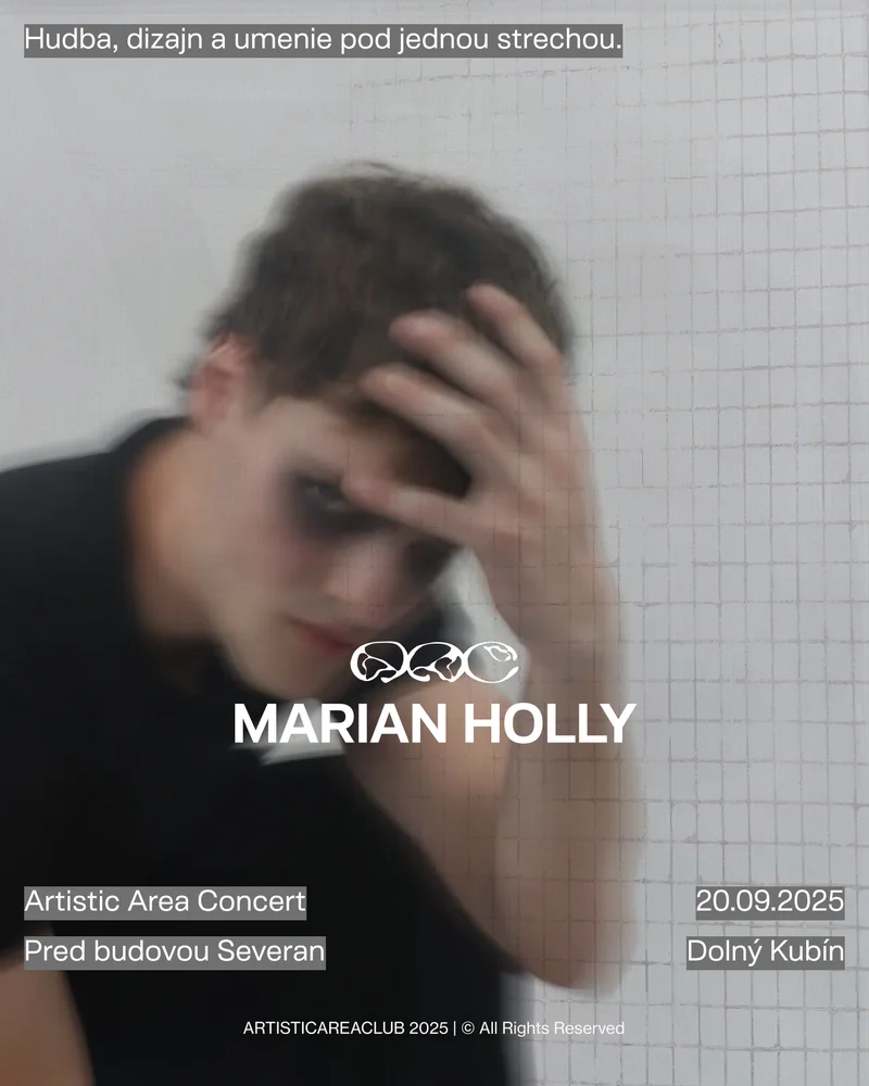
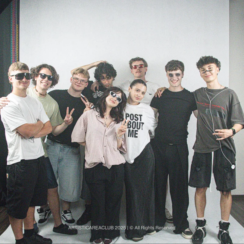
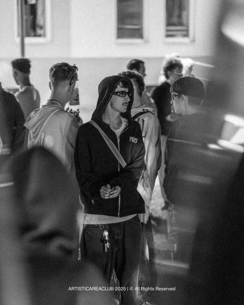
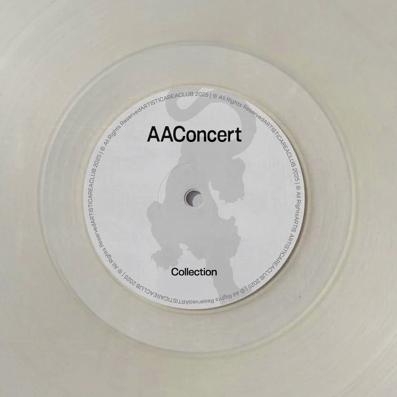
Music, design and art here mostly ran in separate lanes, and the events that did exist rarely treated any of them with much care. Artistic Area Club started to put them in one room and take the result seriously, and it had to stay open, so the brand could not read like a members-only badge. The logo works from that idea: separate liquids poured together until they set into a single shape, the letters AAC running into one another instead of lining up. The website carries the same intent. It is a timeline and a portfolio of everything the club has done, so someone arriving cold can see there is real history behind it, and someone who missed a night can see what they missed and show up to the next one. Photos from each event are there to download, so the evening goes home with the people who were in it. The visual changes from event to event on purpose. One manual applied to everything would turn the club into a company, and the look belongs to the artists who build each night. A few elements repeat; the rest is made once and stays tied to that one evening.
- Adobe Illustrator
- Adobe Photoshop
- Framer
- Figma
- Notion