

Shipped inside a continuously optimised national service used by millions.
eDesk is where Slovak citizens and companies receive and handle official documents from the state. Once the platform became mandatory, every rough edge in it stopped being an inconvenience and became a problem for millions of people at once.
Together with Lighting Beetle we ran the redesign as an ongoing programme rather than a single handover. Workshops with stakeholders, feedback gathered from real users, prototypes put in front of people and reworked, all held together by one design system so the service stayed consistent while it kept changing.
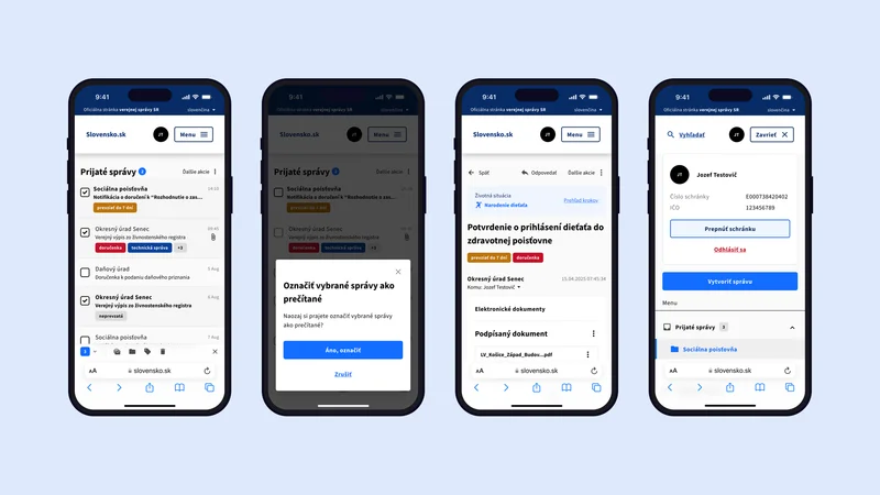
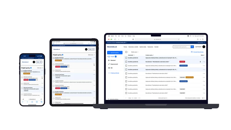
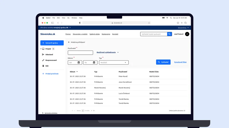
A large share of that work went into how the service behaves on different screens. People open official mail on a phone while queuing as often as on a desktop at work, so every view had to hold up from a narrow phone to a wide monitor: the same actions reachable, the same information readable, nothing pushed out of sight or left to horizontal scrolling.
I joined the UX side as a junior designer and worked on the redesign inside that process. It was the first time I saw a service of this scale up close, where one unclear label or a step in the wrong place costs thousands of people an afternoon, and where nothing ships on taste alone. A lot of how I work now, research first and decisions you can defend, comes from here.
- UX/UI
- Web
- Figma
What others say
“I mentored Marek from his first steps in UX and watched him quickly grow into a designer who cares about every pixel. On the Propodnikave redesign, he co-led the design direction, rebuilt the information architecture and championed a mobile-first approach that increased returning users by 40%, all while coordinating five developers. At Skyro, he mentored junior designers with patience and real empathy. On eDesk at Slovensko.sk, a national platform used by millions, he showed the maturity and sense of responsibility that such a project demands. Curious, collaborative and reliable, he’s someone I would gladly work with again.”
 Richard EgyedProduct Designer
Let’s talk
Working on something similar? Send me a few lines, or grab a slot and we’ll talk it through.
Tell me what you’re working on. A few sentences are enough to start.
15 minutes, no strings. Pick a slot that suits you.
Rather look me up first? That’s fine, I’m there too.